Zigter
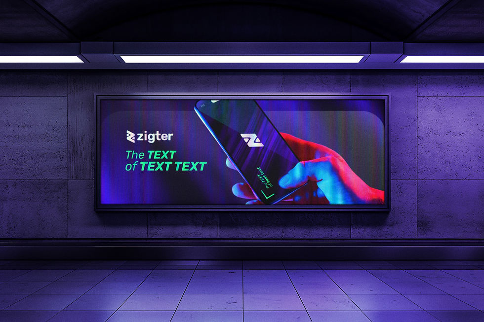
Zigter's brand mark is built from three symbolic elements fused into a single geometric construction: a person seen from above with arms wide open — evoking the act of giving, receiving, and welcoming —, a bold "Z" that anchors the brand's name and communicates direction and energy, and a boomerang that embodies reciprocity and continuous exchange. Developed over a precise grid of diagonal axes and spacing nodes, the isotype achieves perfect proportional balance at every scale, where each line and curve carries intentional narrative weight.
The color palette lives at the intersection of technology and human energy — deep, saturated purples establish a sense of depth and authority, while an electric neon green punctuates the system with boldness and vitality, creating a high-contrast tension that feels both digital-native and alive. Lighter lavender tones soften the composition and provide breathing room, rounding out a palette that is vibrant without being aggressive. The wordmark — set in a heavy rounded-geometric typeface — pairs naturally with the icon's angular dynamism, forming an identity that is confident, contemporary, and built to resonate across all digital surfaces.